In-app notifications are messages delivered to users inside a running application — not on their device’s lock screen, not in their email inbox, but directly within the product experience itself. They appear as modals, banners, tooltips, or slideouts while a user is actively engaged with your app.
For SaaS businesses, in-app notifications are one of the highest-leverage channels available: they reach users at the exact moment of engagement, require no third-party delivery infrastructure, and achieve dramatically higher visibility than email. This guide covers what in-app notifications are, the five main types, how they differ from push notifications, and the six best practices that separate effective notification strategies from ones that drive users away.
What are in-app notifications?
An in-app notification is a contextual message shown to users while they are actively using your application. Unlike push notifications (which appear on the device screen when the app is closed) or email (which lives in a separate inbox), in-app notifications are woven into the product interface itself.
In SaaS products, these notifications serve as a real-time communication layer between the product team and the user. They can announce new features, guide users through onboarding flows, prompt feedback at the right moment, or alert users to important account events — all without requiring the user to leave the application.
Because they appear during active sessions, in-app notifications have a significant contextual advantage: the user is already engaged, already thinking about the product, and far more likely to act on a relevant message than they would be hours later in an email.
Why are in-app notifications important?
In-app notifications have become a core tool for SaaS growth because they directly influence the moments that matter most in the user journey:
- They re-engage users who have gone dormant within the current session
- They increase feature adoption by surfacing functionality users have not discovered
- They reduce churn by catching at-risk users with targeted, timely messages
- They convert trial users by delivering the right upgrade prompt at high-intent moments
- They collect feedback without requiring users to navigate to a separate survey tool
- They announce product updates to users who are already engaged and most likely to care
Push Notifications vs. In-App Notifications: Key Differences
These two channels are frequently confused, but they serve different purposes and reach users in fundamentally different contexts. Understanding the distinction helps you choose the right channel for each message type.
| Factor | In-App Notifications | Push Notifications |
|---|---|---|
| When delivered | While user is active in the app | Anytime — including when app is closed |
| Where it appears | Inside the application UI | Device lock screen or notification tray |
| Requires opt-in? | No — shown to all active users | Yes — users must grant permission |
| Best for | Onboarding, feature announcements, feedback, upsells | Re-engagement, time-sensitive alerts, reminders |
| Context richness | High — can include rich media, CTAs, multi-step flows | Low — limited to short text, maybe an image |
| Deliverability | Near 100% for active sessions | Varies — depends on OS permissions and quiet hours |
| Fatigue risk | Moderate — session-limited | High — can reach users at any time |
The practical takeaway: use in-app notifications for messages that are only relevant to users who are already engaged with your product. Use push notifications for bringing users back to the product when they are away. For most feature announcements, onboarding prompts, and feedback requests, in-app is the correct channel.
5 Types of In-App Notifications (and When to Use Each)
Not all in-app notifications work the same way. Each format has a different visual footprint, level of interruption, and ideal use case. Choosing the wrong format for the message is one of the most common mistakes product teams make.
1. Modals
Modals are overlay windows that appear on top of the current page, requiring the user to interact before continuing. They are the highest-interruption format and should be used sparingly — reserved for messages that genuinely require immediate action, such as a critical security notice, a trial expiration warning, or a major new feature announcement that changes core workflow. Because modals block the entire interface, overusing them trains users to dismiss them without reading.
Best for: Critical alerts, major feature announcements, trial conversion prompts, required confirmations.
2. Tooltips
Tooltips are small contextual callouts anchored to a specific UI element. They appear when a user hovers over or approaches a particular button, field, or feature — and they explain what that element does. Tooltips are low-interruption and highly contextual, making them ideal for onboarding flows where you want to guide users through the interface without pulling them away from their task.
Best for: Onboarding walkthroughs, feature discovery, UI element explanations, keyboard shortcut hints.
3. Banners and Notification Bars
Banners are horizontal strips that appear at the top or bottom of the screen. They are dismissible, persistent, and low-interruption — users can see the message without having their workflow blocked. Banners work well for time-sensitive announcements (planned maintenance, limited-time offers, important policy changes) and for status alerts that the user should be aware of but does not need to act on immediately.
Best for: Status updates, time-limited offers, maintenance notices, account health alerts such as “Your trial ends in 3 days”.
4. Slideouts (Slide-in Panels)
Slideouts appear from the corner or side of the screen and partially overlay the interface without blocking it entirely. They offer more visual space than a tooltip or banner but are less disruptive than a full modal. Slideouts are well-suited to feature announcements where you want to include a short description, a screenshot, and a CTA — enough context for the user to decide whether to explore, without forcing a hard stop.
Best for: Feature announcements, new content availability alerts, soft upgrade prompts, product tips of the day.
5. In-App Notification Center (Inbox)
An in-app notification center is a persistent panel — usually accessed via a bell icon — that stores a log of recent product updates, announcements, and alerts. Unlike the other formats, the notification center is not pushed to the user; they visit it when they choose. This makes it low-interruption and high-value for users who want to stay informed on their own schedule. Tools like AnnounceKit make it straightforward to embed a branded notification widget into any SaaS product, giving teams a centralized changelog and announcement hub directly inside the app.
Best for: Changelog entries, product update history, release notes, ongoing communications that users may want to reference later.
Why do you need in-app notifications to grow your SaaS product?
A SaaS product team’s core growth levers are activation, retention, and expansion. In-app notifications are directly actionable on all three. Here are eight concrete use cases where in-app notifications drive measurable business outcomes:
Drive user education via in-app notification
According to Wyzowl’s statistics, 80% of users say they delete an app because they do not know how to use it. In-app notifications solve this by delivering contextual guidance at the exact moment a user encounters a new feature or workflow. Rather than relying on users to find documentation or attend demo calls, you can surface relevant tooltips, walkthroughs, and prompts that match where the user is in their journey.
Product tours driven by in-app notifications can quickly showcase core feature value, highlight advanced capabilities, and offer different guidance paths depending on the user’s role or progress. Milanote, for example, uses in-app notifications extensively during first-time registration to walk users through core features contextually, achieving onboarding without any manual intervention.
Convert users from one plan to a higher plan
Your product data tells you exactly who is approaching their usage limits, who is on a free trial with high engagement, and who has visited the pricing page but not converted. A well-timed in-app notification at these moments — a discount code, a feature preview of the next plan tier, or a simple usage-limit alert — can significantly move conversion rates without any sales call required.
The key is precision: sending upgrade prompts to all users indiscriminately creates fatigue and damages trust. Targeting them to users who have demonstrated high intent (pricing page visits, usage thresholds, feature-limit encounters) makes the same message feel helpful rather than pushy.
Request feedback by using an in-app notification
Research shows that around 20% of customers never leave feedback through traditional channels. In-app notifications solve this by catching users immediately after a meaningful action — completing a task, using a feature for the first time, or reaching a milestone — when their experience is fresh and their motivation to share it is highest.
Rather than sending a generic post-session survey email, you can trigger a one-question in-app prompt at the exact moment of relevance. AnnounceKit lets users leave emoji reactions or text comments directly on individual product announcements — embedding feedback collection into the announcement itself. You can also pair in-app feedback with feature voting to prioritize your roadmap based on what users actually request.
Remind users about new features and updates
Email open rates for product update announcements hover around 20-25%, meaning three-quarters of your users miss feature releases entirely. In-app notifications reach users during active sessions when they are most likely to explore a new feature immediately.
Effective feature announcement notifications keep the message focused on user benefit, include a direct link to the feature, and use urgency appropriately. For teams shipping frequently, an in-app product updates feed ensures users always have a reliable place to see what has changed, even if they missed the initial announcement.
Re-engage dormant users within a session
Some users log in, poke around, and leave without completing any meaningful action. Triggered in-app notifications can intercept this behavior — surfacing a relevant prompt when a user spends more than 30 seconds on a page without taking action, or when they navigate to a setup screen without completing configuration. These nudge notifications do not need to be elaborate: a single sentence pointing to the next obvious step can dramatically increase session depth and feature adoption rates.
Reduce churn with proactive alerts
Users who are about to cancel almost always show behavioral signals first: reduced login frequency, decreased feature usage, support ticket spikes. In-app notifications allow you to act on these signals before cancellation. A targeted message offering a check-in call, a relevant help article, or a temporary discount at the first sign of disengagement is far more effective than a win-back email sent after the subscription has already lapsed.
Drive upsells and cross-sells contextually
In-app notifications are the most natural channel for contextual upsells because they can be triggered by the exact action that signals upgrade readiness. If a user tries to access a premium feature they do not have access to, an in-app notification explaining what they are missing and offering a trial of the premium tier converts at dramatically higher rates than a generic upgrade email. The context does the selling work.
Solicit reviews and referrals at peak satisfaction
The best moment to ask a user to leave a review or refer a colleague is immediately after they have achieved a meaningful outcome with your product. In-app notifications let you trigger review requests at moments of demonstrated success: a project completed, a milestone reached, a goal achieved. This timing alignment produces review rates several times higher than batch email campaigns.
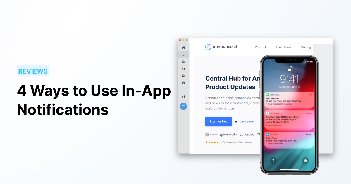
The only tool you need to use for announcing product updates: AnnounceKit
AnnounceKit is an all-in-one changelog tool that helps you create targeted new feature announcements, share them within an in-app notification center, send announcement emails, and distribute them across social media channels.
Boost important announcements with AnnounceKit
Grab the attention of your visitors by enabling Boosters for important announcements. Boosters are elements built into your app that direct your users to the announcements you want to highlight. They include several eye-catching elements that encourage your users to check out your announcement, so they will not miss anything important.
Use widgets to inform your users
While your customers are using your app, you will have the chance to draw attention to your product announcements, updates, improvements, and news with eye-catching notification widgets. AnnounceKit widgets allow you to implement a notification center inside your website with rich content support — images, videos, and embedded documents — and an attention-grabbing indicator that increases the visibility of your announcements.
The idea of collecting feedback when making an announcement sounds good!
Allow users to leave feedback by clicking on emojis or sending comments directly. With AnnounceKit, you can easily collect feedback for the updates you announce, then use those reactions to inform your product roadmap. The best way to understand the benefits of a product is to use it — AnnounceKit is waiting to be tried with all its features.
6 Best Practices for In-App Notifications
The difference between in-app notifications that drive engagement and those that drive users toward the mute setting comes down to these six practices:
1. Match message to moment (contextual triggering)
The most powerful in-app notifications are triggered by specific user behaviors, not scheduled timers. A feedback prompt shown immediately after a user completes their first export will outperform the same prompt shown to all users on day 7, regardless of what they have done. Map your notifications to the specific actions and milestones that signal readiness for the message. This requires behavioral event tracking, but the investment pays off immediately in engagement rates.
2. Segment your audience
Not every notification is relevant to every user. An onboarding tooltip shown to a power user who has been on your platform for two years will feel patronizing. An upgrade prompt shown to a user who just signed up 10 minutes ago will feel premature. Segment notifications by plan tier, tenure, feature usage history, role, and lifecycle stage. The more precisely targeted a notification, the higher its relevance and the less it contributes to notification fatigue.
3. Set frequency caps to prevent fatigue
Notification fatigue is real and cumulative. Users who receive too many in-app messages begin dismissing them reflexively — regardless of content — and eventually start associating the product with interruption. Implement hard frequency caps (for example, no more than one modal per session and no more than three banner notifications per week per user) and enforce them globally across all notification campaigns.
4. Write for clarity, not cleverness
Every notification should pass a simple test: can the user understand what it is, why it matters to them, and what to do next — in under five seconds? Keep body copy to two to three sentences maximum. Use plain language. Make the CTA specific and action-oriented (“See what’s new” beats “Learn more”). Avoid puns or metaphors that require the user to decode intent before acting.
5. Design CTAs that make the next step obvious
Every notification should have a single, clear call to action. Multiple CTAs create decision paralysis and reduce click-through rates. Decide what action you most want the user to take, make that the primary button, and offer only a dismiss option as secondary. For notifications that surface a feature, the CTA should navigate directly to that feature — not to a blog post about it or a generic dashboard.
6. A/B test copy and timing, not just design
Most teams A/B test the visual design of notifications but neglect copy and trigger timing — which are often the higher-leverage variables. Test whether a question-framed headline outperforms a statement. Test whether a modal shown after the third session converts better than one shown after the first login. Run one variable at a time, maintain statistical significance thresholds, and document results systematically. Compounding small copy and timing improvements over several cycles can double engagement rates.
How to Measure In-App Notification Performance
Running in-app notifications without measuring their impact is running blind. These are the core metrics every product team should track for each notification campaign:
Click-through rate (CTR)
CTR measures the percentage of users who saw the notification and clicked the primary CTA. For in-app notifications, a healthy CTR varies significantly by format — modals typically see 15-30% CTR for relevant messages, while banners range from 2-8%. Track CTR by notification type and segment, not just in aggregate, to identify which combinations are working. A low CTR almost always signals a mismatch between message relevance and audience targeting, or a CTA that fails to communicate clear value.
Dismissal and opt-out rate
A high dismissal rate on a specific notification type is an early warning sign that your frequency, targeting, or message relevance needs adjustment. If users are dismissing notifications without reading them, the format or trigger timing is likely wrong. Opt-out rates — where users actively disable all in-app notifications — represent a more serious signal that your overall volume is too high. Monitor both at the campaign level and the aggregate account level.
Conversion impact
For notifications designed to drive a specific outcome (feature adoption, plan upgrade, review submission), track whether users who interacted with the notification completed the target action at a higher rate than those who did not see it. This requires a control group — either through A/B testing or by comparing matched cohorts. Without a control group, you cannot know whether the notification caused the conversion or whether those users would have converted anyway.
Feature adoption rate post-notification
For feature announcement notifications specifically, track whether users who saw and clicked the notification are actively using the feature 7, 14, and 30 days later. A notification that drives a single click but no sustained usage indicates the feature itself may need better in-product guidance. This long-term adoption tracking is more valuable than click-through rate alone for measuring the true impact of your notification strategy.
Common Challenges: Avoiding Notification Fatigue
Notification fatigue occurs when users are exposed to so many in-app messages that they begin to disengage from all of them — including the ones that matter. It is one of the most common failure modes for teams that adopt in-app notifications without a governance framework. The symptoms are subtle at first: a gradual decline in CTR across campaigns, an uptick in dismissal speeds, and eventually increased churn among users who received the highest notification volumes.
Prevention requires proactive design, not reactive adjustment. Start with a conservative frequency cap and raise it only when data justifies it. Audit your notification stack quarterly and sunset or refresh campaigns that have run the longest with the lowest engagement. Give users meaningful control — a notification preferences panel where users can opt into the categories they find valuable signals respect for their attention and often improves overall satisfaction.
The counterintuitive lesson: the teams that send fewer, better-targeted in-app notifications consistently outperform those that treat every product update as a notification trigger. Restraint is a competitive advantage.
Frequently Asked Questions
What is the difference between in-app notifications and push notifications?
In-app notifications appear inside your application while a user is actively using it — they are part of the product interface. Push notifications appear on a user’s device screen even when the app is closed or running in the background. In-app notifications require no user permission to show and achieve near-100% delivery to active sessions; push notifications require explicit opt-in from users and must compete with every other app on their device for attention. They serve complementary roles: in-app for engaged users, push for re-engagement.
How often should I send in-app notifications?
A conservative starting point is no more than one interruptive notification (modal or slideout) per user session, and no more than two to three banner or tooltip-style notifications per week. The right frequency depends on your product’s usage pattern — daily-use tools can sustain higher notification volumes than tools used weekly or monthly. The clearest signal that you are sending too many is a rising dismissal rate combined with declining CTR across your notification campaigns.
What makes a good in-app notification?
A good in-app notification does three things well: it reaches the right user at the right moment, it communicates a single clear value or action in two to three sentences, and it makes the next step obvious with a specific, action-oriented CTA. The most effective notifications are triggered by user behavior (not scheduled timers), targeted to a specific segment rather than all users, and tied to a measurable outcome. Clarity beats cleverness — users decide in under five seconds whether a notification is worth their attention.
How do I measure in-app notification performance?
The core metrics are click-through rate (CTR), dismissal rate, and conversion impact on your target action (feature adoption, plan upgrade, review submission). CTR tells you whether your message and CTA are resonating; dismissal rate tells you whether your frequency and targeting are appropriate; conversion impact tells you whether the notification is actually achieving its business goal. For conversion impact, always compare against a control group to confirm the notification caused the outcome rather than simply accompanying it.
What in-app notification format should I use for feature announcements?
For major feature releases that require user action or a workflow change, a modal ensures visibility but should be used judiciously. For incremental improvements or optional new features, a slideout or banner is less disruptive while still surfacing the message during active sessions. For ongoing feature communication across releases, an in-app notification center gives users a persistent, self-serve way to stay current without requiring you to interrupt them with every update. Many teams use a combination: a slideout for the initial announcement and a notification center entry for the evergreen record.
Can in-app notifications help reduce churn?
Yes — when targeted correctly, in-app notifications are one of the most effective early churn interventions available. Because they reach users during active sessions, they can surface targeted help, check-in offers, or relevant feature suggestions at the first behavioral signs of disengagement — often weeks before a cancellation decision. The key is combining behavioral data (declining login frequency, reduced feature usage, error rate spikes) with targeted notification triggers that address the specific friction point the user is experiencing.
Wrapping up
In-app notifications are one of the highest-leverage communication channels available to SaaS teams — but only when deployed with discipline. The format matters: modals for critical moments, tooltips for contextual guidance, banners for persistent alerts, slideouts for feature announcements, and notification centers for ongoing product communication. The targeting matters: behavioral triggers outperform scheduled broadcasts. The frequency matters: restraint builds trust.
Used well, in-app notifications increase feature adoption, reduce churn, improve trial-to-paid conversion, and keep users engaged across the full customer lifecycle. Used poorly, they train users to ignore everything you send. The difference between the two outcomes is almost entirely in execution: the right message, to the right user, at the right moment, with the right follow-through to measure impact and iterate.