Let’s be honest — we’ve all clicked “Remind me later” on an app update without reading a word.
Or worse, instinctively closed a modal just to get back to what we were doing. And don’t even get us started on tooltips that vanish before we figure out what they were trying to say.
Now flip that around: your product is the one trying to communicate something important. A new feature, a crucial alert, or a nudge to take action. But instead of engaging users, you’re interrupting them, or worse, being ignored.
The problem isn’t what you said. It’s how you said it. Or when you said it.
In-app messaging is a powerful tool, but only when matched to the right moment. Misuse it, and you risk annoying users or being ignored altogether.
This article breaks down the key differences between banners, modals, and tooltips so you can boost engagement without breaking the user flow. Learn when to use each for maximum impact.
Table of Contents
- Why UX Delivery Patterns Matter More Than You Think
- 3 UX Delivery Patterns: In-App Banners vs. Modals vs. Tooltips
- #1: In-App Banners: Subtle, Persistent, and Context-Aware
- #2: Modals: High-Impact, High-Commitment
- #3: Tooltips: Guided, Granular, and User-Friendly
- How To Choose the Right Format for the Right Moment
- Real-World Scenarios and Best Practices
- Want To Deliver the Right Message at the Right Time? Make It Easy With AnnounceKit
Why UX Delivery Patterns Matter More Than You Think
Your product is now your marketing, onboarding, and support channel — all living inside the interface.
New feature? Announce it in-app.
User confused? Show a tooltip.
Need confirmation? Drop a modal.
This is how modern product communication works: no emails, no waiting, just instant context.
But here’s the problem — how you deliver a message can make or break the experience. Show a modal while someone’s mid-task? You’re interrupting, not helping. Banner overload? Users start tuning everything out.
The wrong format at the wrong moment leads to frustration. Missed opportunities. Users quietly walking away.
That’s why choosing between banners, modals, and tooltips isn’t a design nitpick. It’s a strategic decision.

3 UX Delivery Patterns: In-App Banners vs. Modals vs. Tooltips
#1: In-App Banners: Subtle, Persistent, and Context-Aware
What Are In-App Banners?
These are slim bars that appear at the top or bottom of your app interface. They sit quietly in the background, delivering info without blocking user interaction.
Think: “Dark mode is live — Check it out in Settings” or a bottom one teasing “New dashboard launching July 15 — sneak peek now available.”
When To Use In-App Banners
In-app banners are your product’s way of saying, “Hey, just so you know…” without getting in the way. They’re perfect for moments when visibility matters, but urgency doesn’t, like:
- Announcing non-critical updates
- Highlighting new or upcoming features
- Displaying system or account status (e.g., billing reminder)
- Promoting optional actions (e.g., “Try the new layout”)
Use them when you want users to notice something, but not drop what they’re doing.
Pros and Cons
Like any UX tool, banners work best when used with intention.
They’re lightweight, non-intrusive, and easy to deploy — but they’re not the right fit for every message.
Here’s the quick breakdown:
Pros:
- Doesn’t interrupt the user experience
- Feels natural in the interface
- Easy to dismiss or ignore without consequence
Cons:
- Can be missed if users are focused elsewhere
- Limited space for detail or explanation
- Overuse leads to banner blindness
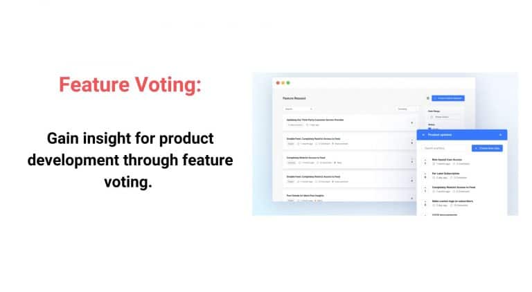
With the right timing and message, banners can quietly boost engagement. And with tools like AnnounceKit, creating and managing in-app banners is fast, scalable, and doesn’t require a dev sprint to launch.
#2: Modals: High-Impact, High-Commitment
What Are Modals?
Modals are those big, unavoidable pop-ups that block your screen until you do something — click a button, fill a form, or close the window.
Think of them as the UX equivalent of your boss tapping you on the shoulder during crunch time: you have to pay attention.
Examples:
- “Are you sure you want to delete this?”
- “Your trial ends in 3 days — upgrade now”
- Login prompts or permission requests
When To Use Modals
Use modals when you need a yes or no, a decision, or immediate action. They’re perfect for things that can’t wait or when ignoring the message would cause problems, like:
- Confirming critical actions
- Requesting important permissions
- Driving time-sensitive upgrades or offers
- Interrupting flows for must-know alerts
But beware — overusing modals is like calling a fire alarm for every little thing. Users get frustrated fast.
Pros and Cons
Modals grab attention like no other pattern. But they’re a double-edged sword: powerful when necessary, annoying when misused.
Pros:
- Commands immediate user focus
- Ideal for critical decisions and confirmations
- Can increase conversion when timed well
Cons:
- Interrupts user flow, causing frustration if overdone
- Risks higher abandonment if users feel pressured
- Can feel aggressive or spammy if poorly targeted
With AnnounceKit, you get fine-tuned control over when and how modals appear, helping you balance urgency with a smooth user experience. That means you drive engagement without driving users away.
#3: Tooltips: Guided, Granular, and User-Friendly
What Are Tooltips?
Tooltips are those little pop-ups that show up next to buttons, icons, or features. They are usually triggered by hover, tap, or during onboarding.
Think of them as the friendly coworker who leans over to explain a tricky part without making a scene.
Examples:
- “Click here to customize your dashboard”
- “New! You can now filter by date range”
- Step-by-step hints during a first-time user walkthrough
When To Use Tooltips
Tooltips work best when you want to educate or guide users in context, without interrupting their flow, such as:
- Explaining new or complex features
- Highlighting UI changes or updates
- Offering quick tips during onboarding
- Supporting feature discovery
On mobile, tooltips need extra care. They can disappear too fast or get lost if not designed thoughtfully.
Pros and Cons
Tooltips are your secret weapon for ongoing user education. They deliver just-in-time guidance that helps users learn features naturally, reducing confusion and support tickets in the long run.
Pros
- Provide contextual, bite-sized education exactly when users need it
- Encourage feature discovery without interrupting flow
- Support long-term learning and reduces support requests
Cons
- Easy to miss if only triggered by hover or brief display
- Can overwhelm the UI if used excessively
- Require careful design on mobile to avoid frustration
With AnnounceKit, tooltips become an interactive onboarding and educational tool you control. You can fine-tune timing and targeting to help users learn your product deeply, without the usual guesswork or extra support burden.
How To Choose the Right Format for the Right Moment
Not every message needs to shout. Sometimes a gentle nudge will do. Other times, you need full attention and a clear call to action.
Choosing between banners, modals, and tooltips boils down to context:
- How urgent is the message?
- What action do you want the user to take?
- Where are they in their journey?
- Which device are they on?
That’s where AnnounceKit steps in. Its smart personalization and automated delivery let you serve the right message, to the right user, at the right time. No guesswork. No spam.
Want to quietly inform? Go banners.
Need a firm decision? Modals it is.
Helping users learn as they go? Tooltips have your back.
AnnounceKit makes it easy to orchestrate all three, scaling your messaging without sacrificing user experience.
Define Your Objective First
Before choosing how to talk to your users, get clear on why you’re talking to them.
Are you:
- Alerting users to something urgent?
- Educating them on a new feature or process?
- Driving a specific action like upgrading or confirming a choice?
- Simply keeping them informed without demanding immediate attention?
Your objective shapes the delivery format.
Want users to act now? Use a modal.
Looking to teach without pressure? Tooltips fit the bill.
Just giving a heads-up? Banners do the job.
Knowing your goal upfront keeps your UX tight and your users happy.
Test and Iterate With Data
No UX decision should be a shot in the dark. Track how your messages perform — views, clicks, dismissals — they all tell a story.
- Are users ignoring your banners? Maybe they’re too subtle.
- Are modals being closed immediately? Could be too aggressive.
- Are tooltips being skipped? Know if they’re poorly timed or placed.
Use these insights to tweak timing, copy, and format. The best in-app messaging isn’t “set and forget”. No, it’s a continuous cycle of testing and improving.
With AnnounceKit’s analytics, you get real-time data on message engagement. You can optimize on the fly and keep users engaged without annoying them.
Personalization and Segmentation Are Key
One size never fits all — especially when it comes to in-app messages. The same announcement might need a subtle banner for seasoned users but a tooltip for newcomers still finding their way.
Smart communication means knowing your audience and tailoring the format to their needs. That’s where segmentation and personalization come in.
With intelligent tools like AnnounceKit, you can run experiments, A/B test different formats, and deliver targeted messages based on user behavior, role, or device.
The result? Messages that hit the mark every time, boosting engagement while respecting user experience.
Real-World Scenarios and Best Practices
Onboarding a New User
You’ve got one shot to make a strong first impression. But do you walk new users through with a full-screen modal wizard or let them explore with subtle tooltip nudges?
Modal Wizard:
Great when your product has a clear path users must follow (think: setting up an integration or configuring core settings).
Modals guide users step by step with no distractions, but they do interrupt and can cause drop-off if they drag on.
Tooltip Sequence:
Perfect for products with flexible workflows or lots of feature areas to explore.
Tooltips can gently point users in the right direction without taking control away. It feels more like “Here if you need me” than “Click here or else.”
Best practice:
Use a quick modal to set expectations or confirm setup, then switch to a tooltip sequence to guide exploration. You’re easing them in without overwhelming them.
AnnounceKit makes it easy to build both experiences and even A/B test them to see what drives better activation and retention.
Rolling Out a New Feature
You’ve just launched something shiny and new.
Now the question is: How do you tell users without overwhelming them?
In-App Banner:
Ideal for non-critical announcements.
Share news of features like a new dashboard view, filter, or theme toggle. It grabs attention without interrupting the user’s current task and is great for ongoing visibility and building awareness over time.
Modal with CTA:
Use this when the new feature is core to the user’s success or when you need them to engage with it now.
A modal with a clear call-to-action (e.g. “Try the new report builder”) is effective when you’re aiming for immediate interaction.
Best practice:
Use banners to tease and build awareness, then trigger modals for users who haven’t engaged after a set time. This layered approach nudges without being pushy.
With AnnounceKit, you can automate this flow. Show the banner to everyone, trigger the modal only for users who haven’t clicked. Smart targeting, minimal disruption.
Announcing Downtime or Policy Changes
These aren’t the fun messages. They’re the ones you can’t afford your customers to miss.
Why modals win here:
When you’re communicating something critical — like scheduled downtime, pricing updates, or changes to terms of service — you need 100% visibility. A modal ensures the message is seen, acknowledged, and not just scrolled past or overlooked.
This is one of the few cases where interruption is not just acceptable. It’s responsible UX.
Best practice:
Use a modal with clear language, timing, and a required acknowledgment. Include links to learn more, but don’t bury the core message. Optionally, follow up with a banner for ongoing visibility until the change takes effect.
With a platform like AnnounceKit, this setup is seamless. You can schedule the message, target specific user segments, and ensure delivery across platforms without having to hard-code anything or disrupt your release schedule.
Want To Deliver the Right Message at the Right Time? Make It Easy With AnnounceKit
In-app messaging isn’t just a UX detail. It’s a product growth engine.
Done right, it drives adoption, reduces support tickets, and keeps users engaged without ever pulling them out of the flow.
Done wrong, it frustrates users, buries important updates, and leaves features unnoticed.
The difference isn’t what you say — it’s how, when, and to whom you say it.
That’s where AnnounceKit delivers. Whether it’s a quick banner, a critical modal, or a smart tooltip sequence, AnnounceKit gives you the tools to communicate intelligently, segment precisely, and iterate fast without depending on your dev team.
If you’re still relying on static banners or hand-coded walkthroughs, you’re falling behind. Your users expect smarter product communication.
Now’s the time to meet that expectation. Start with AnnounceKit and turn your in-app messaging into a competitive advantage.