56% of users uninstall apps within 7 days of installation, or 70% of your new users visit your app once and never return.
Huh? These are very high rates.
But why?
There are several reasons for that, such as having too many ads and notifications, limited storage space, or offering no value.
However, providing a poor first time user experience is one of the most damaging reasons that cause customers never to return.
Have you ever thought of how your product makes your new users feel at first sight after they sign up?
Think about it more often.
Before thinking, let’s get ready for where to start.
This article will teach you (at least, will try) what this First Time User Experience (FTUE) is andhow can you improve a first time user experience to improve your onboarding process and eventually, product success.
What is this First Time User Experience (FTUE)?
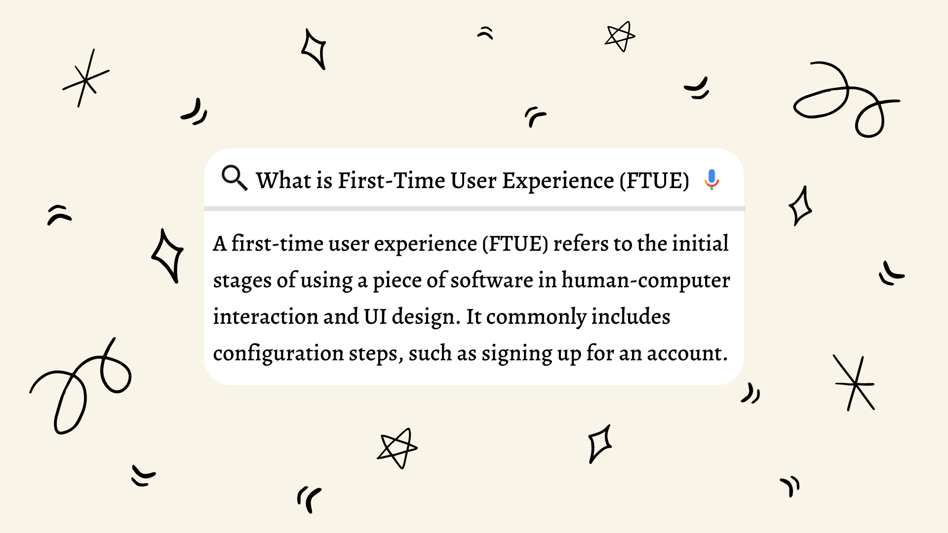
“In human-computer interaction and UI design, a first time user experience (FTUE) refers to the initial stages of using a piece of software.” says Wikipedia.
Let’s make it more clear. First time user experience refers to the first step of the user onboarding process. It is an impression -a feeling users get in when interacting with your product for the first time.

Why it is essential for an efficient onboarding process?
You’ll never get a second chance to make a first impression
Will Rogers
Onboarding is all about getting used to your product. If you want your users to get used to it and go further, you should start with an awesome big bang first impression.
As we stated before, a first time user experience is an impression -a feeling users get in when interacting with your product for the first time. Of course, it is not possible to judge the whole product just by looking at it only for 5 seconds. However, it is a 5-seconds journey to keep them in and continue their onboarding process for further understanding of your product.
Therefore, making a good start will keep you a step ahead of the rest.
5 best practices to improve your First-Time User Experience
1. A Good an Engaging Landing Page
Before mentioning all others, I would like to point out the importance of a landing page.
The home initial page is the first piece of the product that new users are exposed to at their first time user experience. Therefore, it is the first encounter, the very first impression.
Most people tend to scan the content rather than really reading it. They mostly rely on what they see in the first 5 seconds of their user experience process. They read titles, pay attention to buttons, visual elements, and the structure of the landing page. In this way, they get the first feeling from the product. Let the user have this chance to understand where they are rather than bothering them with a complicated page.
Therefore, your landing page should be perfectly designed to improve the first time user experience.
Let’s make it clear. What specifically you can do for an effective landing page?
- Avoid using too many animations and popping things. People may get irritated seeing this much visuals coming out of nowhere right after the first login. They would like to see clear page to understand what they can do there.
- Design a clear hierarcy. Which title appears where and what buttons and images appear on the landing page and the hierarchy of them is important. So make them easy to scan and organize them by their severity.
- Write short titles that narrate a bigger story. An effective single phrase is more efficient than a long paragraph. Similarly, people usually don’t want to read long paragraphs at first even if it provides valuable information. Therefore, you should take their attention with a geniuosy-written title to make them read more.
- Include visual element with a gist. Visual element can be very tricky. If you solely focus on designing the perfect visuality, you may miss the main part of its purpose. As it is in the case of title, your visual elements should give the idea of your product to at the first sight.
- Show your product or service in action. People simply want to see what they can do with your product. Therefore, showing them your product or service in action on your landing page will shorten the time they get used to your product and get started to onboarding process. Provide your new users with use cases, examples or other sources.
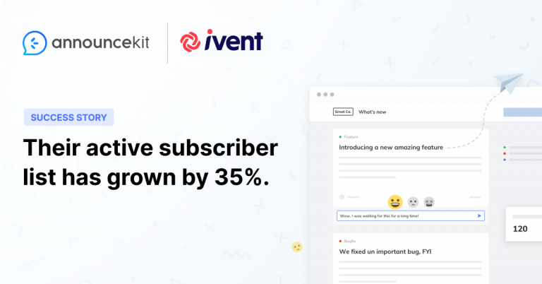
- Have “What’s New” option on your landing page. Show your new users you are improving your product constantly. Users most likely to trust you and your product if you announce product updates.
Let’s see an example and evaluate it.
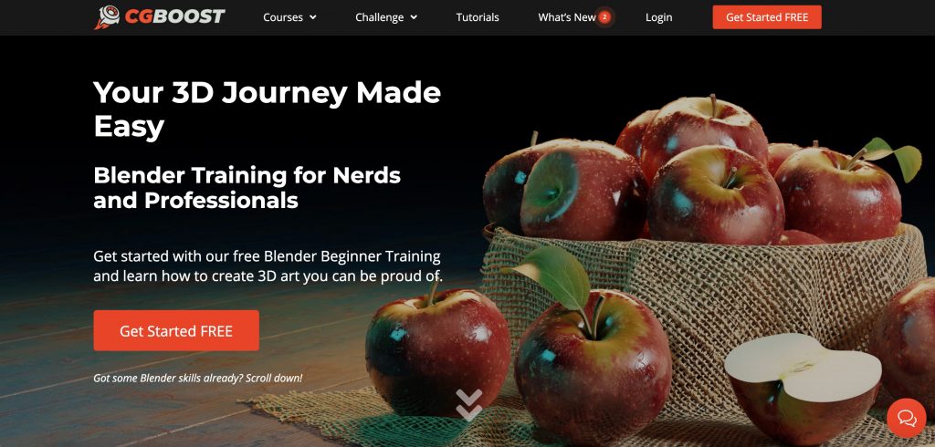
The landing page of CG Boost perfectly fits what we are trying to say here. It gives new users what they can do with their product at the first sight by showing their service in action -perfect 3D apples. It has an attractive title and a short description with a CTA button at the end of it. The only crowd on their page is apples, which they intentionally designed.
2. An Engaging Welcoming E-Mail or Message on Your Page
After users sign up, it is important to send a welcoming e-mail or give a welcoming message on your page that is engaging, not irritating.
Welcoming users with an engaging message to your app is one of the best ways to give a good first impression. Show your users that you care for them. Of course, it will be automated mail or message. However, it will make a difference if you have a personal voice.
3. An Informative but Enjoyable Walkthrough
Walkthroughs make users’ first experience with your product easier.
You should focus on users’ needs andexpectations while considering their emotional states while constructing their journey. Think about what users may ask and work on them. They can ask such questions as:
- What is happening now?
- What can I do here?
- What should I do?
- What could happen more?
- How many steps does this process consist of?
- What is it’s benefits?
- How can I pass to next step?
- What is happening next?
It is important to let users know about some of the steps in your onboarding process and product tour. Otherwise, they may get mad at you and exit the site. This is an undesired consequence.
4. A Chatbot
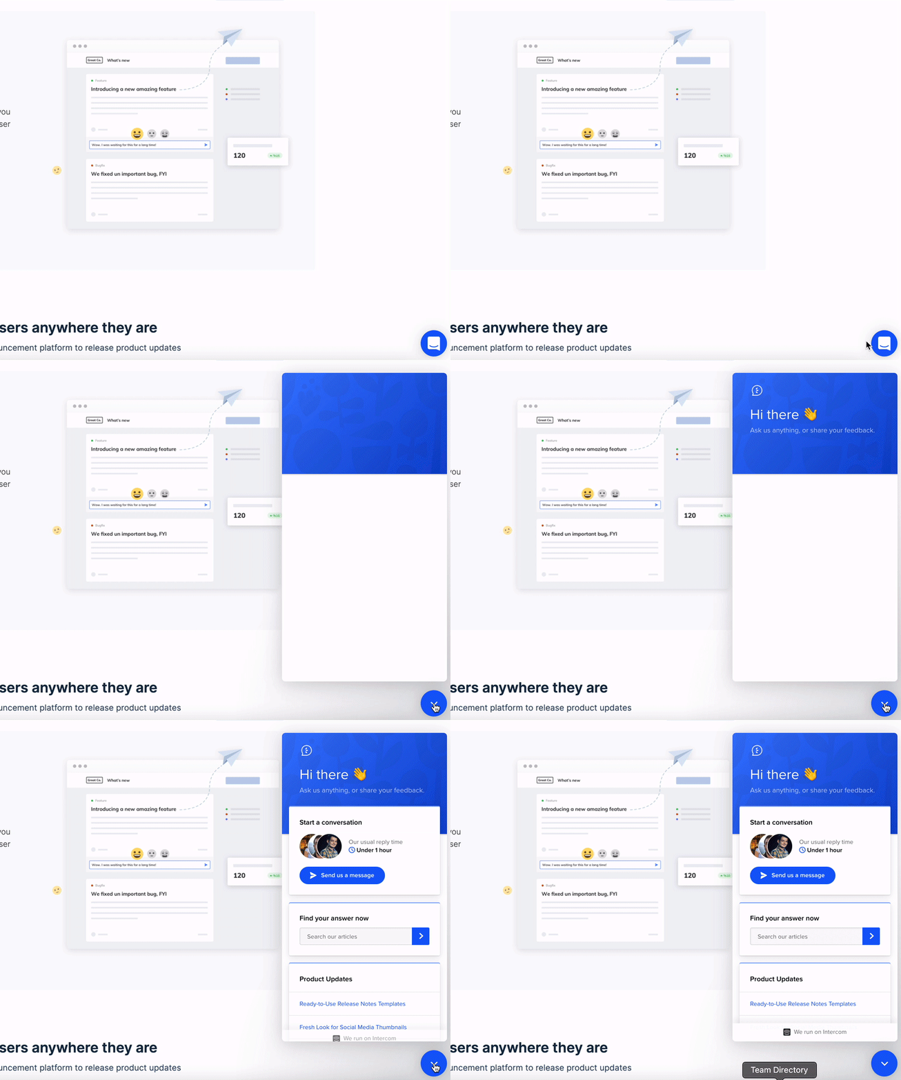
Trust the power of this little guy embedded in your website.
When you get into a restaurant, there are always people that you can ask anything about the food, reservation, or service. A chatbot is like having the same spirit! It makes people more comfortable to ask anything they wonder while moving around your product.
4. An Early Feedback
A successful first time user experience should end with getting feedback -you should ask for quick feedback from users as a final step of this process. This shows that you care for their opinions to reflect on their first time experience, and give them a chance to have a voice in your product.
You should only remember not to be too insistent when asking for feedback. Let the leavers go, the stayers are on our side!

Quick Setup, Easy to Use, and Many Integrations
Manage your product announcements from a single place and easily distribute them
across multiple channels.
Conclusion
The first impression is the last impression. Therefore, make your first time user experience unforgettable to keep your users around as it is an important part of your onboarding process.
When you get better in the first time user experience with these 5 best practices, you will definitely see your customers saying “Jesus! This is what I have been looking for.” or “Let’s get right into this!”
That’s all folks… I tried to explain to you what first time user experience is andhow could you improve a first time user experience to improve your onboarding process.
Check our SaaS Onboarding Best Practices to support your perfect first time user experience with further perfection!

