
This article was last updated in September, 2023.
Product success metrics are… Well, they’re required. Without them, what’s success? Can you really define it?
The thing with these metrics is that the answer isn’t clear.
I’ll give a really easy comparison:
Text your 3 closest friends and ask them what they define personal success as.
Each one will give you a different answer. And, before you know it, you’ll likely be having a conversation with them about the meaning of life itself…

Thankfully, having a SaaS or software business is a little more black and white than life itself. There are some general metrics for product success that are agreed upon and others that are worth considering for your unique business.
In this guide, we walk through how we define product success, what some KPIs are, and how you can track and analyze product success for a potential future exit (yep, acquisition!)
Table of Contents
- Metrics to Predict Product Success
- Metrics are not equal. Data does not equal data
- How to define metrics for a product? What’s the end goal?
- Product Success Metrics You Should Consider Tracking
- Again, metrics are just metrics. There’s a bigger story to tell
Quick Setup, Easy to Use, and Many Integrations
Manage your product announcements from a single place and easily distribute them
across multiple channels.

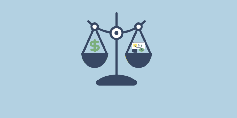
These product successes are important for a lot of reasons. Firstly, they are important decision-making points, because they can lead the company to better product decisions. Also, they can help product managers to get executive approval for the products easier.
Product success metrics are quantifiable measurements that show whether a product is meeting its business and user goals — typically across revenue, engagement, retention, and customer satisfaction. They turn vague questions like “is this product working?” into concrete numbers product managers can act on. The most useful metrics combine a leading indicator (signals what is about to happen, like activation rate) with a lagging indicator (confirms what already happened, like MRR), and they are tied directly to a single overarching goal known as the North Star Metric.
This guide walks through the 12 product success metrics every product manager should track in 2026, with the formula or measurement method for each, real-world examples from companies like Spotify, Slack, and Airbnb, and a step-by-step framework for choosing the right KPIs for your SaaS product. You’ll also find a dedicated section on the AARRR Pirate Metrics framework, North Star Metric examples, vanity metrics to avoid, and a full FAQ answering the questions product teams ask most about measuring product success.
Metrics to Predict Product Success
There are various types of product success metrics. There are metrics to predict the business success of a specific product or financial performance, metrics to improve user engagement, metrics to keep the user attention high and metrics to understand the user contentment. Now, we are going to look at all those product success metrics mentioned above and their examples.
Metrics are not equal. Data does not equal data.
Don’t track the wrong stuff.
We see it over and over again. Businesses get extremely excited about showing us their metrics.
“Look at this number!”
“Check out this graph!”
And then when you ask them “how’s your business’s health?” they say something like “well, we’re not profitable and if we don’t raise another substantial round in the next 6 months, then we’re going out of business.”
How to define metrics for a product? What’s the end goal?
Product goals usually directly align with business goals.
And there are many, many business goals.
Here’s a quick example of how a business goal may influence a product goal. Let’s use a SaaS company has a hypothetical example:
- Business Goal: Get acquired for $50M+ by 2027
- How to Reach Business Goal:
- Expected multiple of 6.5x revenue
- ARR needs to hit $7.7M (meaning MRR needs to hit $640,000)
- Product Goal to Reach Business Goal: Get as many users as possible as fast as possible and keep them as users.
- Product Metric 1: MRR and ARR moving towards $7.7M
- Product Metric 2: CAC < ARPU (meaning that for every customer you acquire, you make more revenue from them than it costs to acquire them)
- Product Metric 3: CLTV is at least 7x CAC (meaning that if you spend $200 to acquire a user, they will bring in a lifetime value of at least $1,400)
Now, these business goals and product metrics might look very different if someone instead has the business goal of…
“Build a lifestyle business where the business profits >$250,000/year and I can work less than 15 hours per week.”
Product Success Metrics You Should Consider Tracking
Revenue Product Metrics:
MRR (Monthly Recurring Revenue)
What is it?
Monthly Recurring Revenue (MRR) represents the predictable and consistent revenue generated from your subscription-based customers each month.
Why is it an Important Product Metric?
MRR is a crucial metric as it provides insight into the stability and growth potential of your business. It helps you understand the health of your subscription model and your ability to retain customers over time.
How do You Calculate it?
MRR can be calculated by adding up the recurring revenue from all active subscriptions within a given month.
How do You Track it?
You can track MRR using dedicated financial tools or subscription management platforms that allow you to monitor changes in your recurring revenue over time.
ARPU (Average Revenue Per User)
What is it?
Average Revenue Per User (ARPU) calculates the average revenue generated from each customer, giving you insights into the value each customer brings to your business.
Why is it an Important Product Metric?
ARPU helps you understand the overall revenue potential of your customer base and identifies segments that contribute the most to your revenue.
How do You Calculate it?
ARPU is calculated by dividing the total revenue by the total number of customers within a specific time frame.
How do You Track it?
ARPU can be tracked on a regular basis by aggregating revenue data and customer counts over time.
CLTV (Customer Lifetime Value)
What is it?
Customer Lifetime Value (CLTV) predicts the total value a customer will bring to your business over the course of their relationship with your company.
Why is it an Important Product Metric?
CLTV helps you understand the long-term impact of customer relationships and assists in making decisions related to customer acquisition and retention strategies.
How do You Calculate it?
CLTV can be calculated by multiplying the average purchase value, purchase frequency, and customer lifespan.
How do You Track it?
CLTV can be tracked by analyzing customer behavior and purchase patterns over time to refine your calculations.

Marketing Product Metrics:
Website Traffic
What is it?
Website traffic measures the number of visitors who access your website within a specific time frame.
Why is it an Important Product Metric?
Website traffic reflects the reach and visibility of your brand, indicating the effectiveness of your online presence and marketing efforts.
How do You Calculate it?
Website traffic can be calculated using tools like Google Analytics, which track the number of unique visitors over time.
How do You Track it?
Use website analytics tools to monitor and visualize trends in your website traffic, allowing you to make informed decisions.
Bounce Rate
What is it?
Bounce rate represents the percentage of visitors who leave your website after viewing only one page.
Why is it an Important Product Metric?
Bounce rate helps identify potential issues with website usability and content engagement, guiding improvements to enhance user experience.
How do You Calculate it?
Bounce rate is calculated by dividing the number of single-page visits by the total number of visits.
How do You Track it?
Monitor bounce rates through web analytics tools and assess how changes to your website impact user engagement.
CPL (Cost Per Lead)
What is it?
Cost Per Lead (CPL) calculates the average cost incurred to acquire a single lead through your marketing efforts.
Why is it an Important Product Metric?
CPL helps evaluate the efficiency of your lead generation campaigns, aiding in budget allocation and campaign optimization.
How do You Calculate it?
CPL is calculated by dividing the total cost of a marketing campaign by the number of leads generated.
How do You Track it?
Monitor campaign costs and leads generated to track CPL over various marketing initiatives.
CMQL (Cost per Marketing Qualified Lead)
What is it?
Cost per Marketing Qualified Lead (CMQL) measures the cost of acquiring leads that meet specific marketing criteria indicating potential for conversion.
Why is it an Important Product Metric?
CMQL helps assess the effectiveness of lead targeting and segmentation strategies, ensuring that acquired leads have higher conversion potential.
How do You Calculate it?
CMQL is calculated by dividing the total cost of a campaign by the number of leads that meet your marketing qualification criteria.
How do You Track it?
Monitor campaign results and the quality of leads generated to refine your lead acquisition strategies.
CSQL (Cost per Sales Qualified Lead)
What is it?
Cost per Sales Qualified Lead (CSQL) evaluates the cost of acquiring leads that meet sales-specific criteria indicating a higher likelihood of conversion.
Why is it an Important Product Metric?
CSQL helps align marketing efforts with sales objectives, ensuring that leads passed to the sales team are more likely to result in conversions.
How do You Calculate it?
CSQL is calculated by dividing the total campaign cost by the number of leads that meet your sales qualification criteria.
How do You Track it?
Regularly assess the alignment between marketing and sales criteria to refine your lead qualification process.
CAC (Customer Acquisition Cost)
What is it?
Customer Acquisition Cost (CAC) quantifies the average cost of acquiring a new customer, encompassing all marketing and sales expenses.
Why is it an Important Product Metric?
CAC provides insights into the efficiency of your customer acquisition strategies, helping you manage costs and optimize your sales funnel.
How do You Calculate it?
CAC is calculated by dividing the total cost of marketing and sales activities by the number of new customers acquired.
How do You Track it?
Continuously monitor the costs associated with acquiring customers and assess how changes impact your CAC.
Product Customer Satisfaction Metrics:

NPS (Net Promoter Score)
What is it?
Net Promoter Score (NPS) measures customer loyalty by asking how likely customers are to recommend your product or service to others.
Why is it an Important Product Metric?
NPS provides insights into customer satisfaction and loyalty, guiding efforts to improve customer experience.
How do You Calculate it?
NPS is calculated by subtracting the percentage of detractors (those unlikely to recommend) from the percentage of promoters (those likely to recommend).
How do You Track it?
Collect NPS data through surveys and track changes over time to gauge improvements in customer sentiment. AnnounceKit actually has an awesome NPS software that you can easily implement.

Daily Active User (DAU) / Monthly Active User (MAU) Ratio
What is it?
The DAU/MAU ratio compares the number of daily active users to the number of monthly active users, indicating the frequency of user engagement.
Why is it an Important Product Metric?
This ratio reflects user engagement patterns, helping you understand the consistency of user interaction with your product.
And if you have engaged users, it means that you can get in front of them more often. For example, if you launch a new feature (that may even require an additional investment… cough cough increased CLTV cough cough), then you have the opportunity to engage them through a release notes tool so they will actually see your new features and releases.
How do You Calculate it?
Calculate DAU by counting the number of unique users in a day and MAU by counting the number of unique users in a month. Divide DAU by MAU and multiply by 100 to get the ratio.
How do You Track it?
Regularly monitor DAU and MAU figures and use the ratio to assess changes in user engagement behavior.
Again, metrics are just metrics. There’s a bigger story to tell.
Let’s say you’ve got an awesome CAC (Customer Acquisition Cost).
But people aren’t actually engaging with your product.
👆If that’s the case, you’re not going to have a sustainable business, even though one product success metrics looks really healthy.
Remember that metrics are important but they are not the end-all-be-all.
Frameworks for Choosing Product Success Metrics: AARRR, RARRA, and the North Star Metric
Picking individual metrics in isolation is one of the most common mistakes in product management. Without a guiding framework, teams end up tracking dozens of numbers that move independently of each other, which produces dashboards that look impressive but don’t answer the only question that matters: is the product growing in a healthy way? Three frameworks have emerged as the practical standard for organizing product success metrics into a coherent system.
AARRR (Pirate Metrics) Framework
AARRR — coined by Dave McClure and nicknamed “Pirate Metrics” because of how it sounds — groups product KPIs into five stages of the customer lifecycle: Acquisition, Activation, Retention, Referral, and Revenue. Each stage has its own primary metric: acquisition tracks how users find your product (visits, signups, traffic source quality), activation measures whether new users reach a meaningful first experience (activation rate, time to value), retention shows whether users come back (DAU/MAU ratio, weekly active users), referral captures whether users invite others (viral coefficient, NPS), and revenue closes the loop with MRR, ARPU, and CLTV. The power of AARRR is that it forces you to track the funnel end-to-end rather than fixating on a single number.
RARRA Framework
RARRA is a re-ordering of AARRR proposed by Thomas Petit and Gabor Papp specifically for modern PLG and mobile SaaS products, where the cost of acquiring users is high and the bottleneck has moved to keeping them. The order becomes Retention, Activation, Referral, Revenue, Acquisition, putting retention at the top to reflect the reality that an unretained user is a leaky bucket no marketing budget can fill. If your product has strong product-market fit but weak ad ROAS, RARRA is the better lens; if you’re still searching for product-market fit, AARRR is more useful because it surfaces where the funnel is breaking earliest.
The North Star Metric (NSM)
The North Star Metric is the single number that best captures the value your product delivers to its users. Unlike AARRR, which is a multi-metric framework, NSM is a forcing function: every team in the company aligns around moving one number, and every other KPI feeds into it as an input metric. Famous examples make the idea concrete: Spotify uses “minutes listened”, Airbnb uses “nights booked”, Slack uses “messages sent within a team”, and Facebook used “monthly active users” in its early growth years. A good North Star Metric is a leading indicator of revenue, reflects real user value (not just engagement for engagement’s sake), and is sensitive enough to move with product changes.
Activation, Time to Value, and Feature Adoption: The PLG-Era Metrics
The shift to product-led growth has pushed three metrics from the activation stage of AARRR into the spotlight. These are arguably the most important early-funnel signals for any modern SaaS product, because they predict retention long before churn shows up.
Activation Rate
Activation Rate is the percentage of new users who reach a defined “aha moment” within their first session or first few days. The exact moment varies: for Slack it was sending 2,000 team messages, for Dropbox it was uploading a file to a folder, for Facebook it was adding 7 friends in 10 days. Formula: Activation Rate = (Users who hit the activation event ÷ Total new signups) × 100. A healthy SaaS activation rate sits between 25% and 40% depending on category; below 20% almost always means the onboarding flow is broken.
Time to Value (TTV) and Time to First Value (TTFV)
Time to Value is the elapsed time between signup and the moment a user first experiences the core benefit of the product. Time to First Value (TTFV) is the same idea applied to the very first meaningful action — the smallest possible win that proves the product works. Measurement: median or 75th-percentile minutes/hours from signup timestamp to first activation event timestamp. Lowering TTV is the single highest-leverage onboarding investment most teams can make: every minute removed from time to first value typically lifts week-1 retention by 1 to 3 percentage points.
Feature Adoption Rate
Feature Adoption Rate is the percentage of active users who use a specific feature within a defined time window. It tells you whether the features you ship are actually moving the needle, or whether they’re sitting unused in the UI. Formula: Feature Adoption Rate = (Monthly active users of feature X ÷ Total monthly active users) × 100. Pair feature adoption with release notes and changelog announcements to close the loop on launches — if a feature lifts adoption above 30% within 30 days of launch and lifts retention as a downstream effect, it’s a genuine win. AnnounceKit’s release notes and in-app announcements help you tie launch communications to feature adoption metrics by surfacing usage data alongside the announcement that drove it.
Churn Rate and Retention Rate
Churn and retention are the same coin viewed from opposite sides, and they are the two metrics most directly tied to long-term SaaS revenue. A product can have stellar acquisition numbers and still die quietly if churn is silently compounding in the background, which is why every serious product team tracks both at multiple cadences.
Customer Churn Rate
Customer Churn Rate is the percentage of customers who cancel or stop using the product over a given period. Formula: Customer Churn Rate = (Customers lost during period ÷ Customers at start of period) × 100. Healthy SaaS churn benchmarks vary by segment: SMB SaaS typically sees 3–5% monthly churn, mid-market 1–2%, and enterprise under 1% (often measured annually instead). Track gross churn (raw cancellations) alongside net churn (which subtracts upgrades and expansion revenue from the same cohort) to get a true picture of revenue health.
Retention Rate
Retention Rate is the percentage of users from a starting cohort who are still active at the end of a defined period. Formula: Retention Rate = (Users active at end of period ÷ Users at start of period) × 100. The most useful version is the cohort retention curve, which plots day-1, day-7, day-30, and day-90 retention for each weekly or monthly signup cohort. A flattening curve (rather than a continuously declining one) is the signature of strong product-market fit — it shows the product has a stable base of users who keep coming back rather than a churning treadmill.
Metrics for New Product Launches
Launching a new product or major feature creates a different measurement problem than running an established product. The historical baselines aren’t there yet, the user base is small, and the noise-to-signal ratio in early data is high. The metrics below are specifically designed for the first 30 to 90 days post-launch, when teams need to know whether to double down or pivot.
Launch-specific metrics to track:
- Sign-up velocity: daily new signups in the first 30 days, compared against the next-best comparable launch in your portfolio.
- Day-1 activation rate: percentage of new signups who hit the activation event on the same day they sign up — a strong leading indicator of overall fit.
- Week-1 retention: percentage of week-0 signups who return in week 1; under 20% almost always means the offer or onboarding misses.
- Feature engagement breadth: average number of distinct features used per user in the first session, which tells you whether the launch communicated the value clearly.
- Qualitative NPS / first-session sentiment: a one-question post-onboarding survey (0–10) gathered automatically inside the product.
- Channel attribution split: share of activations coming from product-led signals (release notes, in-app announcements) versus paid acquisition.
Tying launch metrics to your product release management process is what separates teams that learn from each launch from teams that ship and forget — every launch should produce a written 30-day retrospective with these numbers attached, so the next launch starts smarter than the last.
Vanity Metrics to Avoid
Vanity metrics are numbers that look impressive in slides but don’t predict business outcomes or guide decisions. They go up and to the right almost by default, which makes teams feel productive without surfacing whether the product is actually working. The five most common offenders are:
- Total signups (cumulative): always grows, never shrinks, and tells you nothing about whether new users actually use the product. Replace with weekly active signups or activated users.
- Total page views: unweighted traffic without conversion context. Replace with conversion-rate-by-page or traffic-to-activated-user ratio.
- Total downloads (mobile): a download isn’t a user. Replace with day-1 retention and day-7 retention from the install cohort.
- Time on site / time on page: can mean engagement or it can mean confusion. Replace with task-completion rate or session-to-conversion rate.
- Social media followers: visible but disconnected from product usage. Replace with referral traffic that activates and engagement-to-signup conversion rate.
The litmus test for whether a metric is vanity or actionable is simple: if the metric goes up by 20%, can you point to a specific decision that would change? If yes, it’s actionable. If the answer is “we’d celebrate,” it’s vanity.
How to Measure Product Success: A 4-Step Framework
Choosing the right product success metrics isn’t about copying another company’s dashboard — it’s about translating your specific product’s goals into a measurement system. The four-step framework below is what most high-functioning product teams use to set up KPIs from scratch.
- Set the goal. Write down, in one sentence, what success looks like for your product over the next 12 months. “Hit $5M ARR” is a goal. “Improve engagement” is not — it’s too vague to measure.
- Identify the user behaviors that signal success. Work backwards from the goal: what do users have to actually do for that goal to be met? If the goal is $5M ARR, the signals are likely “convert from trial to paid”, “stay paid for 12+ months”, and “expand seats”.
- Pick one North Star Metric and 4–6 input KPIs. The NSM should capture the user value most tied to your goal (e.g., “weekly active teams”). The input KPIs should be the levers that move the NSM (e.g., activation rate, week-4 retention, feature adoption rate, NPS, churn rate).
- Define the reporting cadence and accountability. Each metric needs an owner, a review cadence (weekly for input KPIs, monthly for NSM and revenue), and a target. Without targets, metrics are just decoration.
Treat this as a living system rather than a one-time exercise. Review the metric set quarterly — if a number hasn’t influenced a decision in three months, retire it; if a question keeps coming up that no metric answers, add a new one. For channel-specific metrics, see also product management metrics for mobile apps, which dives deeper into the mobile-specific KPI stack.
Conversion Rate
Conversion Rate is the percentage of users who complete a desired action — most often moving from one stage of the funnel to the next, such as from free trial to paid subscriber, from visitor to signup, or from onboarding to first activation. It is arguably the most actionable single metric in product management because every percentage point of improvement compounds directly into revenue without requiring additional acquisition spend.
Formula: Conversion Rate = (Users who completed the action ÷ Total users who had the opportunity) × 100
For SaaS products, trial-to-paid conversion typically ranges from 2% to 5% for freemium models and 15% to 25% for time-limited free trials with active sales involvement. A conversion rate below 2% on a self-serve trial almost always indicates a mismatch between the value promised in marketing and the value experienced during onboarding. Diagnosing low conversion requires pairing it with activation rate and time to value — most conversion problems are really activation problems in disguise.
Track conversion rate at every major funnel transition, not just the final purchase event. Visitor-to-signup, signup-to-activated, activated-to-retained, and retained-to-expanded are all conversion moments that compound into each other. Improving visitor-to-signup conversion by 20% while holding all downstream rates constant will lift final revenue by the same 20%.
Revenue Growth Rate
Revenue Growth Rate measures how quickly a company’s top-line revenue is expanding over a given period, expressed as a percentage. Where MRR captures the absolute level of recurring revenue and ARPU captures per-user efficiency, Revenue Growth Rate captures the velocity of the business — the speed at which it is getting larger. Investors, acquirers, and boards use Revenue Growth Rate as one of the first screens for business health.
Formula: Revenue Growth Rate = ((Revenue in Period B − Revenue in Period A) ÷ Revenue in Period A) × 100
A widely cited benchmark for early-stage SaaS is the “Triple, Triple, Double, Double, Double” rule: triple ARR in years one and two, then double it in years three, four, and five on the way to $100M ARR. At a more operational level, most growth-stage SaaS products target 15–30% month-over-month growth in the early scaling phase, settling toward 8–12% monthly growth as the base grows. Revenue Growth Rate should always be reported alongside net revenue churn — a 20% growth rate with 15% annual churn is much less healthy than a 15% growth rate with 2% annual churn, because net expansion is the more durable engine.
Break Revenue Growth Rate down by its components: new business growth, expansion revenue growth (upsells and seat additions from existing customers), and churned revenue loss. When total revenue growth slows, this decomposition pinpoints whether the problem is in acquisition, expansion, or churn — and each requires a different product response.
Customer Effort Score (CES)
Customer Effort Score (CES) measures how much effort a customer had to exert to accomplish a specific task with your product — completing onboarding, finding a feature, resolving a support issue, or completing a workflow. The underlying research from Gartner and the Corporate Executive Board found that reducing customer effort is a stronger predictor of loyalty than delighting customers: 94% of customers who report low effort intend to repurchase, while 96% of those who report high effort intend to churn or defect.
Measurement: CES is collected via a single post-interaction survey question: “How easy was it to [complete this task] with [product]?” Responses use a 7-point scale from “Very Difficult” (1) to “Very Easy” (7). CES = average score across all respondents. Higher scores are better.
CES is particularly powerful for identifying friction in the critical path of your product — the sequence of steps every user must complete to reach core value. A single high-effort step can suppress activation rate and retention for an entire cohort even when every other metric looks healthy. Common high-effort hotspots include integrations setup, data import, permission configuration, and billing workflows. The best teams track CES at the task level (e.g., “connect your first integration”) rather than only at the account level, which gives them surgical precision on where to invest UX resources.
Use CES alongside NPS for a complete customer health picture: NPS captures overall relationship satisfaction, while CES captures moment-to-moment friction. They often diverge — a customer can love your product and still score it poorly on CES for a specific workflow, which is exactly the signal your product and design teams need.
Stickiness: The DAU/MAU Ratio as a Standalone Metric
Stickiness is the ratio of daily active users (DAU) to monthly active users (MAU), and it is the canonical measure of how habitual a product’s usage has become. A stickiness ratio of 50% means that the average user engages with the product on 15 out of every 30 days — a strong signal that the product has become part of their daily workflow. A ratio of 10% means the average user drops in only 3 days per month, which typically indicates a tool used occasionally rather than one embedded in core workflows.
Formula: Stickiness = (DAU ÷ MAU) × 100
Benchmark targets vary significantly by product category. Consumer social products (Facebook, Twitter) historically targeted 50%+ stickiness. B2B SaaS products built around daily workflows — project management, Slack-style communication, CRMs used by sales teams — typically see 25–50%. Products used weekly rather than daily by design (payroll tools, quarterly review software) should use a WAU/MAU ratio instead, as DAU/MAU will systematically understate engagement and mislead the team.
Stickiness is a leading indicator of expansion revenue and a lagging indicator of activation quality. Products with high stickiness see significantly higher NPS, lower churn, and higher upgrade rates, because daily users are both more satisfied and more exposed to upsell opportunities inside the product. If stickiness is low for your product category, the root cause is almost always in activation — users who never internalize a daily use case for the product will never develop the habit that drives a high DAU/MAU ratio.
Product Development KPIs
Most product KPI frameworks focus on user behavior and revenue outcomes — the downstream results of what engineering builds. Product Development KPIs measure the health and velocity of the build process itself. These metrics matter because slow, bug-heavy development processes directly suppress product-led growth: if time to market is long, competitors ship faster; if defect density is high, customer satisfaction erodes; if team velocity degrades, roadmap commitments slip. High-performing product organizations track development KPIs alongside user-facing metrics so they can intervene on the input side before output metrics degrade.
Time to Market
Time to Market (TTM) is the elapsed calendar time from the moment a feature enters active development (the first engineering sprint) to the moment it is live in production for all customers. It is the most direct measure of organizational speed. Formula: TTM = Production release date − Development start date. Benchmark targets vary by team size and tech stack; most high-performing teams at the 25-person stage target 2–6 weeks for a significant feature, under 1 week for an iteration or fix. Reducing TTM requires both process improvements (smaller batch sizes, faster code review cycles, continuous deployment pipelines) and architectural decisions (modular systems that allow isolated feature releases without system-wide rebuilds).
Defect Density
Defect Density is the number of confirmed software defects per unit of code, typically measured as bugs per 1,000 lines of code (KLOC) or bugs per feature shipped per sprint. It is the primary measure of code quality and test coverage adequacy. Formula: Defect Density = Total defects ÷ Size of the software module (KLOC or feature count). Industry averages run between 1 and 25 defects per KLOC depending on system complexity and domain; products with robust automated test suites typically see under 5 per KLOC. High defect density correlates directly with elevated support ticket volume, customer dissatisfaction, and engineering time diverted from new feature work to bug remediation — which in turn degrades Time to Market.
Team Velocity
Team Velocity is the average number of story points (or equivalent effort units) a development team completes per sprint. It is primarily a capacity planning metric rather than a performance measurement — the goal is not to maximize velocity as an end in itself, but to measure it consistently so sprint commitments and roadmap timelines become predictable. Formula: Velocity = Total story points completed ÷ Number of sprints (rolling average, typically over 3–5 sprints). A healthy velocity trend is stable or slowly growing; a suddenly falling velocity signals blockers (technical debt load, team disruptions, unclear requirements) that need active intervention. Never use velocity to compare across teams — it is an internal calibration tool, not a performance ranking.
Feature Adoption Rate (as a Development KPI)
Feature Adoption Rate closes the loop between the development process and user outcomes. When tracked as a development KPI, it answers whether the features the team shipped in the last cycle are being used by users. A team with high velocity and low feature adoption is shipping the wrong things fast. Pair feature adoption rate with a 30-day post-ship review for every significant feature — if adoption is below 15% at day 30, the feature either has a UX problem, a discoverability problem, or a product-market fit problem, each of which calls for a different response.
The HEART Framework for UX Metrics
The HEART Framework is a structured UX measurement system developed by Google’s research team (Kerry Rodden, Hilary Hutchinson, and Xin Fu) to bring the same rigor to user experience measurement that engineering teams apply to system performance. Where AARRR and RARRA measure business funnel health, HEART measures the quality of the experience itself — the signal most closely tied to whether users find the product genuinely valuable versus merely tolerable.
HEART stands for five dimensions: Happiness (users’ subjective satisfaction and attitude toward the product, measured via CSAT, NPS, or CES), Engagement (depth and frequency of interaction beyond just active sessions — features used per session, actions completed, content consumed), Adoption (new users acquiring the product and completing first-time use of core features — activation rate is the primary adoption metric), Retention (whether users return over time — cohort retention curves and churn rate), and Task Success (whether users accomplish specific in-product tasks efficiently — completion rate, error rate, and time on task per workflow).
The framework is designed to be used alongside a Goals-Signals-Metrics (GSM) process: for each HEART dimension, you first define the goal (“we want users to find the dashboard valuable”), then identify the behavioral signal that indicates that goal is being met (“users who view the dashboard weekly”), then select the metric that captures that signal quantitatively (“weekly dashboard view rate”). This three-step process prevents the common mistake of picking metrics first and retrofitting them to goals.
For SaaS product teams, the most actionable HEART dimensions are usually Adoption, Retention, and Task Success, because they pinpoint specific product interactions that can be improved. Happiness metrics like NPS are useful but slower-moving; Engagement metrics can be misleading if the product is designed for efficient in-and-out use cases rather than deep session engagement. Apply HEART selectively: pick the 2–3 dimensions most relevant to your current strategic priority and track the rest at lower frequency.
Earned Growth Rate (EGR)
Earned Growth Rate (EGR) is a metric introduced by Fred Reichheld (the creator of NPS) and Bain & Company as a complement to NPS that measures how much of a company’s revenue growth is “earned” through genuinely satisfied customers — returning customers and customers acquired through referrals — versus purchased through advertising and promotional spending. It separates organic, loyalty-driven growth from paid growth, which can mask structural product weaknesses behind an aggressive marketing budget.
Formula: EGR = (Net Revenue Retention Rate + Earned New Customer Revenue Rate) − 100%
Where Net Revenue Retention (NRR) captures how much of last year’s revenue base remained and expanded this year, and Earned New Customer Revenue Rate captures the share of new customer revenue that came from referrals or organic word-of-mouth (not paid channels). A company with 110% NRR and 30% of new revenue from referrals has an EGR of approximately 40%, indicating that nearly half its total growth is compounding from customer satisfaction rather than marketing spend.
EGR is particularly valuable for product-led growth companies because it makes the financial case for investing in product experience rather than paid acquisition. If EGR is rising, satisfied customers are becoming your most efficient growth engine. If EGR is flat or falling while total revenue growth looks healthy, you are paying increasingly to replace customers who are not recommending you — a structurally fragile position. Track EGR quarterly alongside NPS and net revenue churn to get a complete picture of whether your product is building durable loyalty or simply buying growth.
AARRR vs. RARRA vs. North Star Metric: Which Framework to Use
The three most widely used product metrics frameworks answer different questions and suit different business stages. Rather than debating which is “best,” high-functioning product teams treat them as complementary lenses. The table below summarizes the key differences to help you choose the right starting point for your product’s current stage.
| Framework | Order of Priority | Best For | Core Question | Primary Risk It Addresses |
|---|---|---|---|---|
| AARRR (Pirate Metrics) | Acquisition → Activation → Retention → Referral → Revenue | Early-stage products still finding product-market fit; companies where the biggest unknown is where the funnel breaks | Where is the funnel leaking? | Spending on acquisition before the product is ready to retain users |
| RARRA | Retention → Activation → Referral → Revenue → Acquisition | PLG / mobile SaaS products with proven product-market fit but high acquisition costs; companies where leaky retention is compounding the CAC problem | Are we retaining the users we pay to acquire? | Filling a leaky bucket faster rather than fixing the leak first |
| North Star Metric | Single metric + input KPIs | Growth-stage and scale-up companies that need cross-team alignment; teams where each function optimizes its own metric at the expense of system-wide health | Is the product delivering its core value at increasing scale? | Local optimization — marketing, product, and engineering each moving different numbers in different directions |
| HEART | Happiness → Engagement → Adoption → Retention → Task Success | UX-heavy products where the user experience is the primary competitive differentiator; teams running redesigns or major onboarding changes | Are users genuinely satisfied and successful with the product? | Optimizing funnel metrics while silently degrading the user experience |
A practical starting point for most SaaS teams: use AARRR to diagnose where the funnel breaks, adopt RARRA as the operating lens once retention is the primary constraint, define a North Star Metric when alignment across teams becomes the bottleneck, and apply HEART for any major UX investment to ensure you are measuring the quality of the experience — not just the quantity of the outcomes.
Frequently Asked Questions About Product Success Metrics
How do you define success metrics for a product?
You define product success metrics by working backwards from your business goal to the user behaviors that prove the goal is being met. Start with one clear goal (for example, $5M ARR within 12 months), identify the 3–5 user actions that lead to it (signing up, activating, retaining, expanding), and choose one quantifiable KPI for each. The full set should include a single North Star Metric, two or three leading indicators, and one or two lagging revenue metrics.
How do you measure product success?
Product success is measured across four dimensions: revenue health (MRR, ARPU, CLTV), user engagement (DAU/MAU, feature adoption rate, session frequency), retention (cohort retention curves, churn rate, NPS), and acquisition efficiency (CAC, LTV/CAC ratio, activation rate). The most reliable single signal is whether the cohort retention curve flattens, because that’s the clearest evidence of product-market fit.
What is the most important product success metric?
For most SaaS products, the single most important metric is the North Star Metric — the one number that captures the core value users get from your product. Below the NSM, the highest-leverage metric is usually retention rate, because retention is what compounds revenue over time and is the truest test of product-market fit. Without retention, every other metric is a leaky bucket.
How is the success of a product evaluated?
The success of a product is evaluated against three benchmarks: its own historical baseline (is it growing month over month?), its category benchmarks (is it growing faster than typical SaaS in the same segment?), and its goal targets (is it on pace for its OKRs?). A product is considered successful when retention is flat or improving, MRR is growing faster than churn, and the North Star Metric is moving in the planned direction quarter over quarter.
What are good examples of product success metrics?
The most cited examples come from category leaders: Spotify tracks “minutes listened” as its North Star Metric, Airbnb tracks “nights booked,” Slack tracks “messages sent within a team,” and Netflix tracks “hours watched per subscriber.” For input metrics, common examples include activation rate (Slack famously found that teams hitting 2,000 messages had near-100% retention), DAU/MAU ratio (Facebook popularized 50%+ as the bar for “sticky” social products), and feature adoption rate.
What’s the difference between a KPI and a metric?
Every KPI is a metric, but not every metric is a KPI. A metric is any quantitative measurement of product behavior or outcome (page views, signups, MRR, time on site). A KPI — Key Performance Indicator — is the small subset of metrics that has been formally designated as critical to evaluating progress against a specific business goal, with targets, owners, and review cadences attached. Most products track hundreds of metrics and graduate only 4–8 of them to KPIs.
How many product success metrics should you track?
Most high-performing product teams operate with one North Star Metric, 4–6 input KPIs that feed into it, and 10–20 supporting diagnostic metrics that get reviewed only when something looks off. Tracking more than that creates dashboard fatigue: nobody knows which numbers are decision-grade and which are background noise. The discipline is in deciding what not to elevate to KPI status, not in adding more.
What are vanity metrics in product management?
Vanity metrics are numbers that look impressive but don’t predict business outcomes or guide decisions. The most common offenders are total cumulative signups (always grows), total page views (unweighted by conversion), total downloads (an install isn’t a user), social media followers, and time on site. Replace each one with a paired actionable metric: cumulative signups becomes activation rate, total page views becomes conversion rate by page, downloads become day-7 retention from install.