First-time user experience (FTUE) is the complete set of interactions a new user has with your product from the moment they sign up until they complete their first meaningful action. It determines whether users stay, return, and eventually become paying customers — or uninstall and never look back.
56% of users uninstall apps within 7 days of installation, and 70% of new users visit an app once and never return. These numbers are not a mystery — they are the direct result of a poor FTUE. Getting this first encounter right is the single highest-leverage investment a product team can make.
This article explains what FTUE is, why it is essential for onboarding success, the most common mistakes teams make, and five proven practices to improve it — with real SaaS examples and a clear framework for measuring results.
What is First-Time User Experience (FTUE)?
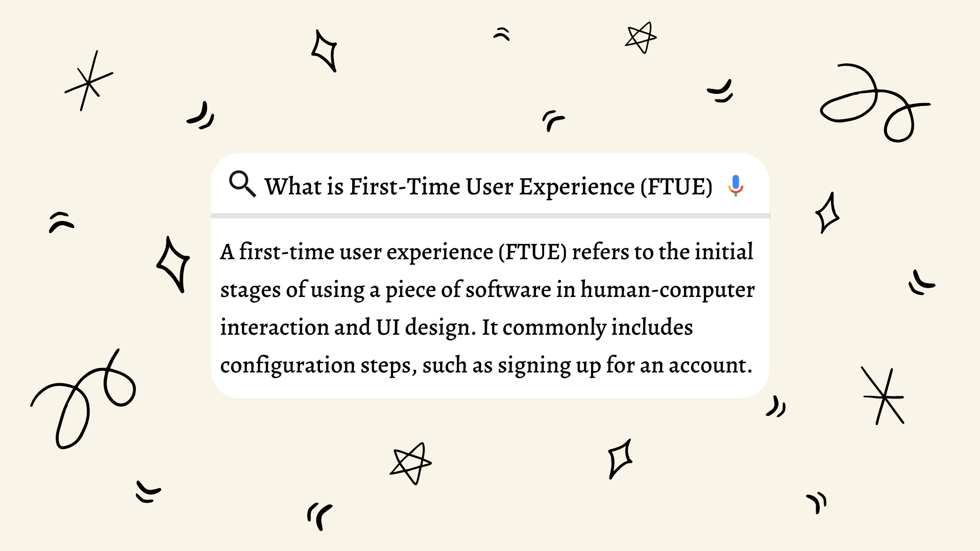
First-time user experience (FTUE) refers to the initial stages of using a piece of software — specifically, the journey a new user takes from their very first interaction with your product through to completing a core action that delivers value. In human-computer interaction and UI design, FTUE encompasses every touchpoint: the landing page, the sign-up flow, the welcome screen, the onboarding walkthrough, and the first moment the user accomplishes something meaningful inside your product.
A simple way to define it: FTUE is the experience; onboarding is the process that surrounds it. Onboarding is the broader sequence of emails, tutorials, tooltips, and check-ins that help users get comfortable with your product over days or weeks. FTUE is the critical first moment — the impression formed in the first session — that determines whether users will engage with onboarding at all. If FTUE fails, no onboarding sequence can recover it.
Think of it as the difference between walking into a new restaurant and the entire dining experience. The moment you open the door, look at the decor, and are greeted (or ignored) by the host — that is FTUE. Everything that follows — the menu, the food, the service — is the broader onboarding. Users decide in the first few minutes whether they want to continue.
Why Is FTUE Essential for an Efficient Onboarding Process?
“You’ll never get a second chance to make a first impression.” — Will Rogers
Onboarding is all about helping users get used to your product and understand its value. But if users disengage in the first session, no onboarding sequence can bring them back. The first five minutes of using a product have a disproportionate impact on whether a user will still be active at Day 7, Day 30, and beyond.
Research consistently shows that users who experience a strong FTUE — one that gets them to a meaningful outcome quickly — have retention rates 2–3x higher than users who struggle or abandon before completing any action. Every point of friction in the first session is a potential exit. Every moment of clarity and delight is a reason to return.
For SaaS products specifically, FTUE is also a direct revenue driver. Free trial and freemium users who complete key onboarding actions in their first session convert to paid plans at dramatically higher rates. Improving FTUE is not just a UX exercise — it is a growth strategy.
What Is the AHA Moment in FTUE?
The AHA moment is the specific instant when a new user first experiences the core value of your product — the moment they think “this is exactly what I needed.” It is not a generic feature tour milestone; it is a deeply personal realization that your product solves a real problem for them. Every successful FTUE is designed to get users to this moment as quickly and frictionlessly as possible.
Different products have different AHA moments, and identifying yours is one of the most important tasks for your product team. Slack’s AHA moment is widely understood to be sending the first message to a teammate and receiving a reply — the instant the user feels the product’s promise of real-time team communication. Figma’s AHA moment happens when a user shares a design with a collaborator and sees them editing in real time — the collaborative multiplayer experience that sets Figma apart. Notion’s AHA moment tends to occur when a user creates their first interconnected database or links pages together, suddenly realizing the product is not just a note-taking app but a flexible workspace system.
To identify your product’s AHA moment, analyze cohorts of users who became long-term retained customers and look for the single action that most reliably predicts their retention. Tools like Mixpanel or Amplitude can help you run this analysis. Once you identify it, redesign your FTUE to remove every barrier between sign-up and that specific moment. Shorten the path, eliminate unnecessary steps, and use in-app guidance to point users directly toward it.
FTUE Examples: What Great Looks Like in SaaS
The best way to understand excellent FTUE design is to look at what top SaaS products actually do. Each of the examples below demonstrates a distinct principle that you can apply to your own product.
Slack is the canonical example of AHA moment optimization. When a new workspace is created, Slack immediately prompts the user to invite at least one teammate before the onboarding is “complete.” This is not accidental — Slack’s data showed that workspaces with multiple active members retained at far higher rates. By making teammate invitation part of the FTUE flow, Slack engineers the conditions for its own AHA moment. New users also encounter Slackbot — a friendly automated assistant that walks through basic features conversationally — which lowers the intimidation factor of starting in a new product.
Notion handles a significant FTUE challenge: the product is so flexible it can feel overwhelming. Their solution is template-first onboarding. When a new user signs up, they are immediately asked what they want to use Notion for — personal notes, team projects, a wiki, a product roadmap — and presented with a pre-built template matching their answer. This converts an open-ended, intimidating blank canvas into a concrete starting point. Users see their AHA moment (a useful, functional workspace) within minutes rather than hours of configuration.
AnnounceKit helps product teams deliver timely in-app announcements as part of their FTUE flow. When new users sign up for a product using AnnounceKit’s changelog widget, they immediately see an embedded “What’s New” panel that communicates recent improvements — this signals product momentum and trust from the very first session. Teams using AnnounceKit can ensure new users are never greeted with a silent, static product; instead, they see an active, improving product from day one, which measurably improves first-session engagement.
5 Best Practices to Improve Your First-Time User Experience
1. A Good and Engaging Landing Page
The home initial page is the first piece of the product that new users are exposed to at their first time user experience. Therefore, it is the first encounter, the very first impression.
Most people tend to scan the content rather than really reading it. They mostly rely on what they see in the first 5 seconds of their user experience process. They read titles, pay attention to buttons, visual elements, and the structure of the landing page. Let the user have this chance to understand where they are rather than bothering them with a complicated page. Your landing page should be perfectly designed to improve the first time user experience.
Avoid using too many animations and popping elements. Design a clear hierarchy of titles, buttons, and images. Write short titles that narrate a bigger story. Include visual elements that show your product in action. Have a “What’s New” option on your landing page to show new users you are constantly improving — users are more likely to trust a product that demonstrates active development.
2. An Engaging Welcoming E-Mail or Message
After users sign up, it is important to send a welcoming e-mail or give a welcoming message on your page that is engaging, not irritating. Welcoming users with an engaging message is one of the best ways to give a good first impression. Show your users that you care for them. Even automated mail will make a difference if it has a personal voice and is sent from a real person’s name rather than a generic “noreply” address.
3. An Informative but Enjoyable Walkthrough
Walkthroughs make users’ first experience with your product easier. You should focus on users’ needs and expectations while considering their emotional states while constructing their journey. Think about what users may ask: What is happening now? What can I do here? What should I do next? How many steps does this process consist of?
It is important to let users know about some of the steps in your onboarding process and product tour. Otherwise, they may get frustrated and exit. The best walkthroughs use interactive guides — not passive video tours — that require the user to perform actual actions. Completion of an action creates a stronger memory trace and moves users closer to the AHA moment.
4. A Chatbot
Trust the power of a well-designed chat assistant embedded in your product. When you get into a restaurant, there are always people you can ask anything about the food, reservation, or service. A chatbot provides the same spirit — it makes people more comfortable asking anything they wonder while exploring your product for the first time. A good FTUE chatbot answers common questions instantly without requiring users to leave the product and search documentation.
5. An Early Feedback Loop
A successful first-time user experience should end with getting feedback — ask for quick feedback from users as a final step of this process. This shows that you care for their opinions and gives them a chance to have a voice in your product. Ask one focused question: “Did you accomplish what you came here to do?” The binary answer tells you more than a lengthy survey. You should only remember not to be too insistent when asking for feedback. Let the leavers go; the stayers are on your side.
5 FTUE Mistakes That Kill User Retention
Understanding what breaks FTUE is just as important as knowing what makes it great. These five mistakes appear repeatedly across SaaS products that struggle with early churn.
1. Not knowing your AHA moment. Many teams design onboarding flows based on what features they are proud of rather than what action statistically predicts long-term retention. If you do not know your product’s AHA moment — the specific action that separates retained users from churned ones — your FTUE is based on guesswork. Run a cohort analysis before designing your onboarding flow.
2. Ignoring returning or partially-activated users. FTUE is not just for brand-new users. Many products have large cohorts of users who signed up, did something, and then returned days later. These partially-activated users are often treated as brand-new by the onboarding system, which creates a jarring, patronizing experience. Design your FTUE to recognize returning users and pick up where they left off.
3. Treating onboarding as an upsell opportunity. A common mistake is to gate core features behind paywalls or upgrade prompts in the first session. If a user cannot experience your product’s value before being asked to pay, they will leave. The FTUE must deliver a taste of genuine value first — then upsell once the user understands what they are paying for.
4. Not testing FTUE flows with real users. Teams often design FTUE based on internal assumptions. What seems obvious to someone who built the product is frequently confusing to a first-time user. Unmoderated user testing — watching recordings of real new users navigating your product for the first time — reveals friction points that no amount of internal review will surface.
5. Treating FTUE as a one-time project. User expectations evolve, competitors improve their onboarding, and your product changes over time. FTUE should be treated as a continuously monitored, continuously optimized experience — not a shipped feature. Teams that revisit their FTUE every quarter consistently outperform teams that treat it as done.
How to Measure First-Time User Experience
Without measurement, FTUE improvement is guesswork. These five metrics give you a clear picture of where your first-time experience is succeeding and where it is losing users.
Time-to-first-value (TTFV) measures how long it takes from sign-up for a new user to complete their first meaningful action — ideally, your product’s AHA moment. A shorter TTFV correlates directly with higher retention. If your average TTFV is more than 30 minutes, your FTUE is too complex.
Onboarding completion rate tracks what percentage of new users complete each step of your onboarding flow. A dramatic drop at any particular step reveals a specific friction point — a form that is too long, a required action that is confusing, or a step that requires information users do not have at hand. Fix the drop-off points first.
Feature discovery rate measures what percentage of new users discover and use a key feature within their first session. If your product’s most valuable feature has a low discovery rate, your FTUE is not surfacing it effectively. Use in-app announcements, tooltips, or guided flows to make key features impossible to miss.
Day-7 and Day-30 retention by onboarding cohort is the ultimate test of FTUE quality. Segment your users by which onboarding variant they experienced and compare their retention at Day 7 and Day 30. This is the only metric that proves whether FTUE improvements actually translate into business outcomes.
Perceived effort score (PES) is a single-question survey sent immediately after the first session: “How much effort did it take to get started?” on a 1–5 scale. Users who rate the effort as low retain at significantly higher rates. A high average effort score is a strong signal that your FTUE needs simplification.
Frequently Asked Questions About FTUE
What does FTUE stand for?
FTUE stands for First-Time User Experience. It refers to the complete set of interactions a new user has with a product from sign-up through their first meaningful use of a core feature. The term is commonly used in SaaS, mobile app development, and product management to describe the critical first session that determines whether users will return.
What is the difference between FTUE and onboarding?
FTUE is the experience — the impression formed during the first session with a product. Onboarding is the broader process that unfolds over days or weeks and includes welcome emails, tutorials, check-in messages, and feature education. FTUE is the critical first chapter of onboarding. If FTUE fails, the rest of the onboarding sequence rarely gets a chance to work.
How do you measure first-time user experience quality?
The most important FTUE metrics are: time-to-first-value (how quickly a new user reaches their AHA moment), onboarding completion rate (what percentage of users finish each onboarding step), feature discovery rate (whether users find and use key features in their first session), and Day-7/Day-30 retention segmented by onboarding cohort. A perceived effort score survey sent after the first session also provides direct qualitative signal.
What is the AHA moment and why does it matter for FTUE?
The AHA moment is the specific instant when a new user first experiences the core value of your product — the moment they understand why it exists and why they need it. It matters because users who reach the AHA moment in their first session retain at dramatically higher rates than those who do not. Designing your FTUE to get users to the AHA moment as quickly as possible is the highest-leverage improvement most products can make.
What are the most common FTUE mistakes?
The most common FTUE mistakes are: not knowing your product’s AHA moment and therefore building onboarding around the wrong actions; ignoring partially-activated returning users; using the first session as an upsell opportunity before users have experienced value; failing to test onboarding flows with real users; and treating FTUE as a one-time project rather than a continuously optimized experience.
How can in-app announcements improve FTUE?
In-app announcements during the first session signal to new users that the product is actively maintained and improving. When new users see a “What’s New” changelog or a recent feature announcement inside the product, it builds trust and demonstrates momentum — two psychological signals that reduce churn in the first session. Tools like AnnounceKit let teams embed changelog widgets directly into their product UI, ensuring new users are greeted by an active, communicative product from the very first interaction.
Conclusion
The first impression is the last impression. Your first-time user experience is the make-or-break moment that determines whether a new user becomes an engaged, paying customer or disappears after a single session. Getting FTUE right is not a one-time project — it is a continuous investment in measuring, testing, and improving the first minutes every new user spends with your product.
Focus on identifying your AHA moment, removing every obstacle between sign-up and that moment, building in real examples and social proof, and measuring the results with the five metrics outlined above. Teams that invest seriously in FTUE consistently see higher Day-7 retention, faster conversion from free to paid, and lower early churn.
When you get better at first-time user experience, you will see your customers saying “This is exactly what I’ve been looking for” — and that is how sustainable SaaS growth begins.
Check our SaaS Onboarding Best Practices to support your perfect first-time user experience with further depth and detail.