We’ve Relaunched Mini-Site As Showcase!
We’ve just relaunched the Mini-Site screen template as Showcase! In addition to the new name, we’ve added a whole bunch of new functionality and options.

SmartLayout™
The SmartLayout™ flexible grid system gives you more control over how the screen is presented to your learners.
Adjust the number of columns
The grid system provides up to 6 columns — simply drag a slider to adjust the number of columns in your layout.

Adjust the height of rows
Click and drag between rows to increase the height of all rows to display larger images.

New banner feature
You can now choose to display a banner for each item allowing you to really showcase each item. To switch banners ON/OFF, click the advanced settings button and choose the display options menu.

You can also resize the banner height, by clicking and dragging the banner up or down.

Fit and fill image options
Images added to the showcase screen items no longer need to be cropped. Just add an image, and it fills the allocated space. If you want to show the entire image, toggle the image fit option. This allows the image to be used for both the banner and the item card without compromising image quality.

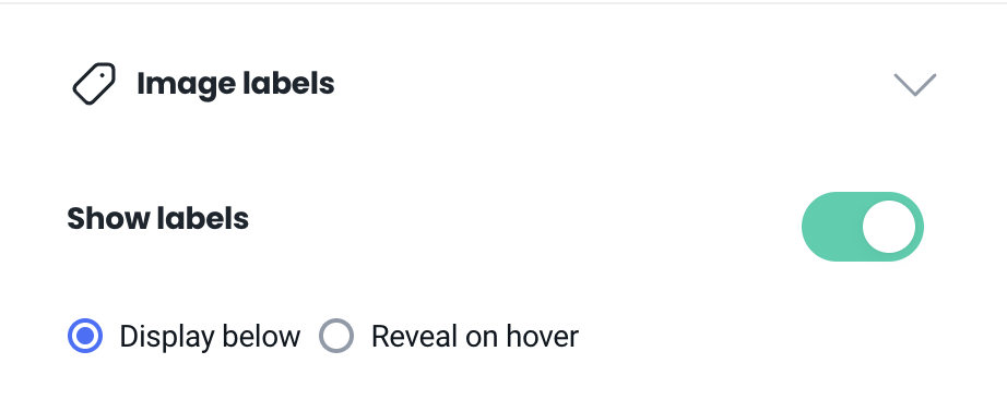
New Label options
Choose to display labels under each image, on hover, or none at all.